
This week has been quite different from the previous ones. Up until today, I have worked almost entirely on designing characters and animating them. However, our programmers are now busy working on putting the animations we already have to use, and we are not that likely to add many more, if any at all. This has resulted in this week becoming devoid of animation, and instead, I have been tasked with designing parts of the GUI.
The one item that I probably found most enjoyable to make this week, was probably the decaying suit. The goal in our game is to defeat all the bugs that are feasting on your suit before it is destroyed, while not getting yourself beat up by the bugs at the same time. We decided to have the player and suit share health pool, and so, we must make sure that the player can easily understand that.
For this, I came up with the idea to attach a picture of the suit to the health bar, showing the player how the suit decays as the health drops.
For this task I first needed a picture of a suit that I could add decay to. I produced a few sketches that I then presented to Sky, he picked a suit and gave me the green and I continued to the next stage.
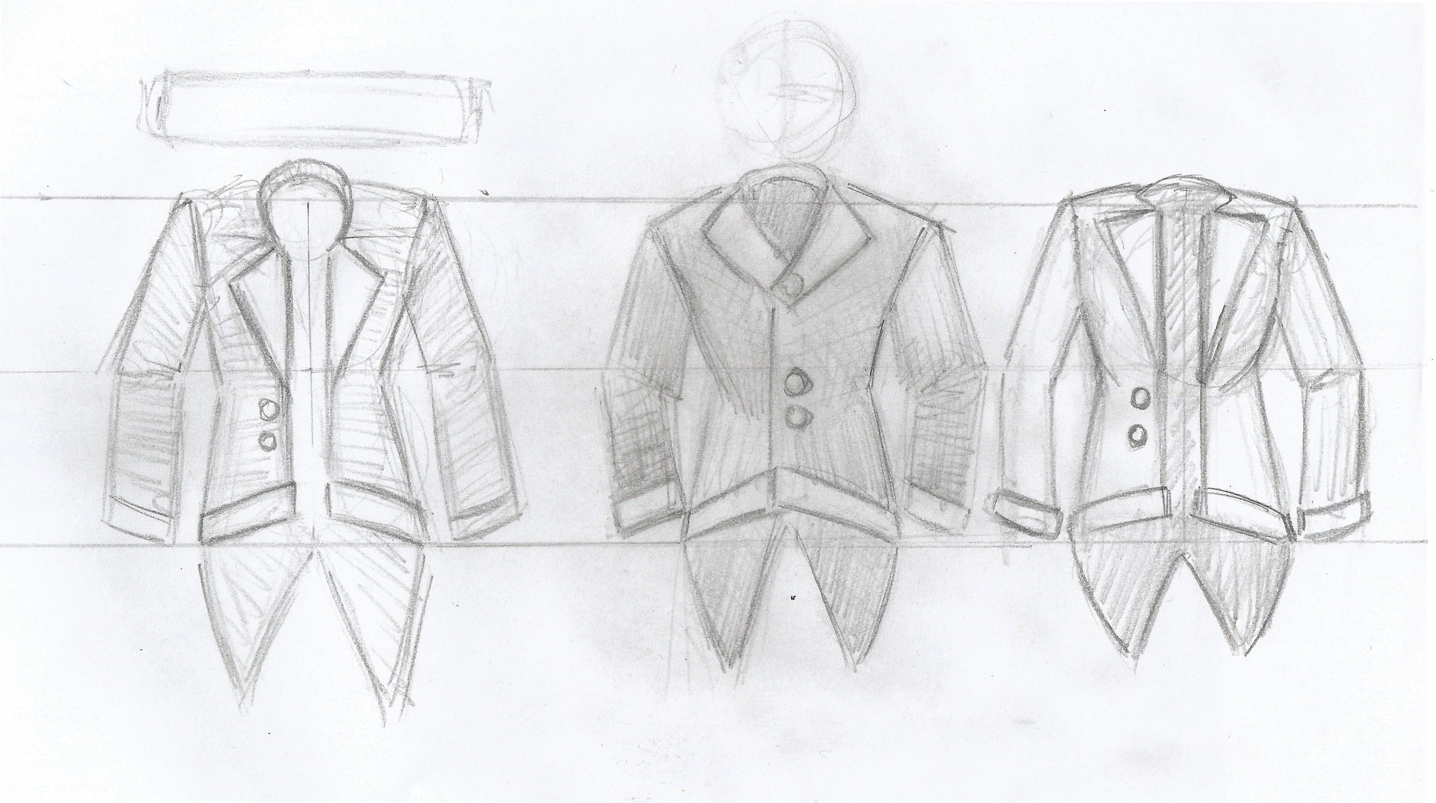
I drew a more symmetric version of the suit in PS, then I went ahead to add the destruction effect. I copied the suit and started adding notches to it, I then copied that one and continued making even more drastic tears and damages with each copy, until their was barley anything left. By that time, I had 7 different versions of the suit. I felt that 7 was not a very good number of stages for the suit to be in, instead I decided to aim for 10. I added some extra pictures between the ones that had a larger difference between them.
As you might have noticed, drawing suits is not my strong side, However, I a happy with the end result. The aim was never to have a picture of a good looking suit, but rather a simple indicator of a suit. Maybe It would have been more fitting to the style if I had put less detail into the tearing, but I think it is alright.

Hello!
Commenting time then!
I read through the post and found many parts of it interesting and it’s also nice to read that communication is moving along. The thing I do although find interesting is that you are linking the suits health to the characters health, as this seems like a very weird way to do it.
I would actually think that there are many ways to make a more interesting link from the character to the suit. Such as the suits health is the maximum health of the character, but you can still take regular damage or something like that. Then the question about how the suit is supposed to take damage appears.
But anyway, I like the look of your suits that you show in the post, but it would be nice with a picture you could look at specifically of the end product at the end of the post since the picture at the top got the top of it cropped.
I think that it looks pretty crisp; some of the details on the suit could be enhanced in my opinion, such as buttons and the folds of the cloth could be enhanced a little. Also the last one looks more like a skull than a suit if I would be honest.
Otherwise keep up the awesome job, From a Van and a Game Designer!
Jolly good show!
The suit-bar is surely a most apt choice for the depiction of health in this scenario, and it most certainly moves my thumb in the upward direction, working against the relentless pull of our hated mistress called Gravity as well as the general negativeness of today’s society.
I also approve of your retelling of the actual work process, as well as the providing of both the concept sketch and the artifact that sprang forth from it.
And it definitively fulfills its duty, giving a clear sense of decay and doom in equal measure, almost pleading the player to be quick and careful both, or else his wife will surely run off with the butcher.
I find myself being especially fond of frame # 7, with the arm hanging on for dear life with just a few stitches struggling to keep hold of its fraying dignity.
Never been a fan of the actual number though, only ill fortune and misery comes from the number 7, 10 is absolutely a better choice.
Naturally, the artifact in question is most vital for the general sanity of the player base, and as such the question of the clearness of the why is, as the saying goes, to be discarded and ignored like a flea on a rabid stoat freshly snatched up from the local wildlife sanctuary.
All in all, you should indeed be happy with the end result, and I look forward to seeing it in the end product.