Category Archives: Uncategorized

BGP Week 3: Ghouls

We are progressing steadily, jump animations and spells has been implemented, and placeholder enemies have been given functional AI. The boss unit has been given it’s first set of animations, along with some planned recoloring, that I’ll get into later. The cave has also begun to take shape, with several assets being modeled by our 3D artists this week.

Personally, I’ve been been working on animations and concept art, as usually. I Made the concept art for the ghoul, an undead man-eating djinni from arabic folklore, that is quite popular in modern fantasy. I gave the ghoul large hands and claws, since it would be their primary tool for ripping their victims apart and attacking Mokhtar (the ghoul might end up ranged in the end though, which would render the meaning of the hands misleading). The ghoul’s body is thin and starved, and he wears a torn loincloth and ripped turban to illustrate their poverty, a trait which puts them in contrast to the wealthy boss, as well as complimenting their hunger. He also wears a pair of ear rings, which apparently symbolize bad behavior in some middle-eastern cultures.

ConceptArt_Ghoul_Blogg

When talking about colors for the ghouls, we came to the conclusion we should change the color scheme for the boss. The original color scheme for the boss was almost the same as Mokhtar’s, and we needed to have more contrast. We also decided that we would give the enemy djinns will be given a more unnatural skin color (mokhtar, who is a djinn in disguise will not be changed). We chose to give the djinn a  blue white to grey color, a color often chosen for djinn in old arabic artwork that will presumably also have them blend into the blue areas of the cave, still ticking out a bit due to the orange colored clothes, and red spots on the skin.

We are still having problems with animating the spider, I have not had a go at it myself, but some of the other artists have tried but not gotten anywhere. We intend to bring the file  to the tutoring on monday, since the problem seem to be of a technical nature. Hopefully we’ll get to the bottom of it next week.

3D Character, another update

Persp02

Since I am quite busy, I will try to keep this short. The model and textures are pretty much done. There is some tweaking that can be done at places, for instance the shoulder puffs, which do look a little bit odd at this time.

There is also a missing polygon on the hat that only disappears in UDK, and a disfunctional alpha texture. There is also some ugly seems under his crouch, however, that might not be of such high importance, considering nobody will really look there.

Missing piece of hat.

I have a lot to do this week, so I might not have time to actually work that much on the final touches on the model. What is most important now, is that I get rid of the hole in the hat, and get the tunic skirt part and feathers to be double sided.

UVCheckerStrauss_UV

Strauss_Diffuse

Strauss_NormalStrauss_Specular

Photogrammetry and Stuff

I read Andrzej Poznanski’s article; ‘Visual Revolution of The Vanishing of Ethan Carter’, and was quite fascinated with what they could do. However, I am wondering, getting the model to render appropriately was quite some trouble, the main pro of this method was to get believable wear and tear etc, and the model must still modified to reduce poly count and get a nice edge flow. Would it not be just a easy to just take reference photos, model the model yourself, then only take photos for textures? I have not yet modeled any high-res models, nor do I have a lot of experience with photogrammetry, and they would not be using it if it did not pay off, so I am obviously missing something.

As a kid, I used to do a lot of Warhammer painting, as well as terrain making. Crafting model miniatures is something that I have always been interested in, and  while making scans of environments from real life is of moderate interest to me, something that I would really like to try out some day is making a game composed of actual hand crafted props. Imagine for instance a Harryhausen or Burton inspired game that actually looks like a stop-motion movie, or a maybe something in fashion with ‘The Dark Crystal’. In short, I think this tool can be (and probably is) used for more than just realistic graphics. If miniature sculpting for games was a profession, it would probably be my dream job.

A pro for using photogrammetry for miniatures instead of outdoor environments, is that you would not have to worry about the weather. Of course, since you have to sculpt the model yourself, the whole point of using photogrammetry to capture the creations of nature is lost.

A tree house I started working on a few years ago but never finished. The only miniature I've got here on Gotland.
A tree house I started working on a few years ago but never finished. The only miniature I’ve got here on Gotland.

When modeling faces, one thing that I find important to think about is that many of the loops circle around certain features, mainly mouth and eyes, rather than the entire head. This seem to be mainly due to that the face muscles actually circle these features in that way, and it would look right if lines were drawn differently. However, it also saves polygons, since we need a high level of detail in the face, relative to the back of the head, and since the loops for the details around the eyes and mouth can be restricted to that area, we do not have to waste polygons circling the entire head.

The nose/cheeks and forehead are the areas that have horizontal loops circling the entire head, they are really just part of the base shape of the head (except for the nose being slightly extrude) and really do not have that much detail. The nose tip and nostrils probably make up the most interesting topology in the face. They nostrils have individual loops such as the mouth and eyes, however, the between the tip and the nostrils, the loops the there are also some of the outer loops of the mouth.

Face_3DCoat

3D Character Update

I have finally finished the mesh my model of Strauss. It sure took some time, but I am quite happy with the final result. I think his large head and collar might be making the rest of his body look less fat, but I think making the head smaller would make him look human, which would not be very good, so I think the balance I have got now is pretty okay. I am also wondering if maybe should have added some thickness to the free-hanging part of the tunic, but might just not be necessary.

Front02

Right02

I realized that his weak leg should be at the same side he is holding the cane, so I switched thick leg is now on the opposite side of where the fat is leaning towards. I think it looks better since before, there is a better visual balance from left to right, and he looks even more twisted when everything is not on the same side.

I ended up at 2893 triangles.Front03

Right03

Character Modeling

Strauss_EdgeFlow

The time for modeling characters has arrived. I started modeling my gnome in class, unfortunately, I have treatment sessions for my psoriasis during in the afternoon, and have to leave halfway through class, then catch up later with tutorial videos.

Front01 Right01

I did get some problems, since the tutorial seemed to be from an earlier year, and there seem to be some differences from what we learned in class. I heard from classmates that one of the things I missed was how to twist the arm to get the appropriate curves on the edge flow: I did not find any of this in the videos.

Persp01 Persp02

I also encountered some difficulties with the body, since the character I am modeling has quite a bit of excessive body fat, which affected the edgeflow a lot, forcing me to tread away from the the guide and think for myself more, when putting down my lines. However, I guess that is a good thing.

I also realized that I have not defined any of his clothes yet. I am not sure if it is a problem, but I might have wanted to do the puff shoulders.

Finally, I am a little worried about doing the face, it looks very different from a normal face. I have made an edgeflow plan for it, but I am not entire sure it will work out.

Anatomy – Analysis of Me

Ken

This week we were to bring a few organic sketches and drawings to criticize and give feedback to each others knowledge of anatomy.

I did not receive as much feedback as I had hoped for, however, there were a few things they mentioned that I cold agree, I probably had to work on some more. One thing that was mentioned was that I had a tendency to use straight lines a bit too much. This does not happen all the time, but it is visible in some of my drawings. I think it is mainly because I do not always have a good workflow, and easily get stuck on small details and lose the perception of the entire picture as a whole.BullKnight

I was given some really good advise on how to practice to avoid breaking the flow and getting stuck on details. I was advised to give myself time challenges, give myself maybe five minutes to make a quick drawing, leaving no time to stop and iterate on minor details. I was reminded of the importance of drawing a lot, and fast to get the flow of drawing the all parts of the body into my head (cognitive therapy right there). The only timing I have previously done on my drawing (except during life drawing sessions) is occasionally looking at my watch and saying to myself; “gee, I have been drawing this hand for three hours, maybe I should move on”.

BullKnight02

Another thing I need to practice more is life drawing. There are a number of parts of the body that I do not exactly know how they look, especially on the back. I am often too lazy to actually find good references when drawing these parts, and that is a hazard for my learning. There is one thing that is far worse than not knowing, and that is knowing wrong. Adopting a flow were I draw faulty anatomy could take me a painful amount of time unlearning, and you never want to have to do that.KoH


As for a plan on what to do the following months to improve, firstly, I would like to spend more time on life drawing. Not only human figures, but also landscapes (which I would say is one of my big weaknesses), props and clothing (especially armor). I used to do life drawing on a daily basis for some time, but started to drop that habit as school got more intense. In any case, as a first goal, I would like to become more secure in human anatomy, and make sure I know the musculature. For this I would also try the speed drawing exercises suggested to me.

As a second goal, I would like to improve my ability to interpret movement and action into my drawings. I studied animation before I came to Gotland, though only the basics, and I am eager to continue exploring that path, learning both how to properly breath life into my still art, and animate. For this there are two books I would like to spend the time reading through; Drawn to Life, that was part of our course literature last year, and The Animator’s Survival kit. I would also like to read Disney Animation: The Illusion of Life, but I from my understanding it is difficult to come by these days.

Finally, as a third goal I would like to be able to put all these things to use, and design my own creatures, with believable anatomy and movement. I have always been interested in mythology, and creating my own worlds and creatures is something I really enjoy, and would like to get better at. For this I would probably need to look into traits of different animals, focusing on analyzing their traits, and how the compliment the animal’s lifestyle and ability to fit into it’s natural habitat.

Board Game Analysis: Portobello Market

This week, we were assigned to play and analyse another board game, we chose ‘Portobello Market’.

‘Portobello Market’ is a two to four player strategy game. The goal of the game is to have your market stalls placed in the most profitable places as possible. This goal is achieved by placing market stalls in alleyways visited by as wealthy people as possible. The game ends at the end of the round the first player places her final stall.

Core Mechanics

The player verbs are; chosing stopwatches, placing objects and moving the bobbin.

The objects are; stopwatches, stalls, customers, and the bobbin. The stopwatches relate to the stalls and customers, by deciding how many of them can be placed. The customers relate to the stalls by affecting the score they provide, the bobbin relates to the stalls by indicating where they are allowed to be placed, as well as the stalls decide where, when, and to whom the bobbin causes players to lose points from their score resource.

The resources are; score and a temporary score, individual for each player and alley, the score being held by stalls before they have been multiplied and collected through the placing of customers.

Stopwatches

Each player has three stopwatch objects in her possession. Each stopwatch has a number on it (a ‘2’, ‘3’ and ‘4’), this property indicates how many objects (market stalls or customers) the player can place on the board each round. Each round, the player chose one stopwatch to use, allowing them to place that number of objects. once a stopwatch has been used, it will not be usable again, until they reset. Every three rounds (when all stopwatches have been used), the stopwatches reset to their original status, making them available to use again.

 Market Stalls

Every player receive a number (decided by the players) of market stall objects at the beginning of the game. Stalls are placed in alleyways on the board. Alleyways are divided into blocks, In order for a stall to be placed in an alleyway, the bobbin must be present in the alleyways associated block. Alleyways have varying amounts of stall slots,  each with a numeric property, indicating the score provided from having a stall in that specific spot. all alleyways have a crossroad in each end, to actually gain the score from the stalls in the alleyways, there must be a customer placed at each end.

Customers

The customer object comes in three types; commoner (grey), upper class (pink), and the mayor (black). The type property affect the score gained from stalls in adjacent alleys through a multiplier (see photo). When an alleyway have two customers at each end, the players with stalls in that alleyway add together all number beneath their personal stalls, then multiply that variable with number assigned to the specific customer combination. When a player makes to choice to place a customer, the picked customer is random from a pool of five grey and five pink. When all customers are used, the mayor will be placed in the final free customer slot.

Stopwatches
Stopwatches and multipliers.

Bobbin

The bobbin indicates which block players are currently allowed to place stalls in. The bobbin’s behavior, is that it can be moved between adjacent blocks by choice of the player who’s turn it currently is. this can be done an infinite number of times, however, the player commanding the bobbin’s movement must sacrifice one point from her score resource, for each uninhabited alleyway the bobbin passes over, and the player will lose a point to every player who holds a majority of stall spots in an alleyway the bobbin passes over.

Interesting mechanic

The bobbin system is what I find the most interesting in this game. The actual scoring system might have some more interesting mechanics on a “technical” level, but what makes the bobbin system so interesting is the effect it has on the rest of the game. First off, it make players compete against each others. If players could place stalls where ever they wanted, most games would probably end up with players not even building close to each other. However, now, when it is expensive to move the bobbin to another block, players rather just stay in one block for as long as possible. This open doors for competitive strategies, were players have to think about where other players might put their stalls, and plan their strategies around that.

IMG_20140923_141900212

We also noticed that this system could provide with some interesting events in the beginning of a match. Since score is required to pay for the boffin’s movement, you had to place a few stalls and two customers before you could move the boffin. One of our players used this to his advantage when most of the rest of us decided to try a tactic were we placed a lot of stalls, and saved the customers for later. He then managed to lock players into blocks without any empty spots for stalls, and they did not have any score to pay for the boffins movement. this could of course be resolved by using your next actions to place some customers, and there is usually somewhere to place them that grants you some points. However, it can still hit hard against a player if she is not prepared for it.

Positive

The best thing about this game is the strategy involved in it. Players are usually building in the same block, and available spots for you to place your stalls is entirely dependent on where the other players placed their stalls. This intense interaction means that you always have to adapt your strategy to your opponents. This makes for diverse and competitive strategies, thus interesting gameplay and replay value.

IMG_20140923_145645294

Negative

Ironically, the biggest drawback of this game is really the same things that makes it so great. If you prefer to play games as mindless pastime rather than a session of intense strategic mind games, you might enjoy this game, as long as you play people with the same intentions as you. I believe that it would be nearly impossible to win, or even enjoy the game as a “casual” player, facing a serious player with intentions to win. There are so many ways in which you can sabotage enemy players and use their actions to your own benefits. I actually witnessed a player being lapped two times on the score counter (that means he had 500 points more than the other player). I bet it would be that fun for the tactical player either, when your opponent doesn’t even try to figure out your plans. This is somewhat mended when you play a game of four players, though I think it would be almost as frustrating to be the only “casual” player among four elites, as being one casual player versus an elite.

Another bad thing are the aesthetics of the game, it does not look like they have tried to actually make the game feel like a competitive game. Instead of actually making money in the game, you just gain “score” from placing your stalls tactically. Also, The box art (although not really part of the game) suggests that this is an easygoing and friendly game, which is not right at all. The game is all about becoming the most successful street market… Uh… Person, but the developers do not seem to think so.

IMG_20140923_145705119

Target Group

The box says eight years+. I am not so sure about this, the gameplay is fairly simple, though I think it might be difficult to actually tactically around this game at that age. For instance, in ‘Risk’, the basic idea is quite strait forward, you want to have as many soldiers in as many countries as possible, by attack enemy countries. then of course, you can dig a lot deeper into more advanced tactics, but the basics are there. However, in ‘Portobello Market’, you have got a lot more complex system, where you have got different score on different stall slots, you need to consider placing customers, and on top of all that, there’s the multipliers from different customer combinations. Maybe I am just underestimating the average eight year old, but I can at least see my own little brother getting very frustrated by the complexity of the rules.

On top of that, there is the scoring system requiring the use of multiplication, and I do not even know if kids begun to learn what that is at that age. On the other hand, If it would happen to be the age they start to learn it, this game might be great for teaching math to kids.

From the look of the game, I would say it is also marketed towards children, or at least children included. Maybe this is a bit off topic for a game analysis, but I must bring up the horribly misleading box art. This game is obviously about competition and

In any case, I would suggest this game for an older audience than the box suggests. I would say strategists would enjoy this game the most, even though the box art does not really suggest this.

IMG_20140923_132042747

Conclusion

All in all, I believe that this game has a lot of interesting gameplay features. However, it does not look like the developers have marketed it properly. The aesthetics that the developers seem to have aimed for, is a stroll down the market street a Saturday afternoon. That is not at all the feeling you get from actually playing the game. As I play the game, it feels very abstract, it does not feel like your setting up market stalls strategically to get more of the customers than the other players, it just feels like placing markers in different patters to gain score. I believe this is because the developers have tried to get away from the feeling of playing as a greedy businessman for some reason. However, that is what you are playing as, so all they do is breaking the fantasy.

If you manage to immerse yourself despite these things, then this is a very fun game with some rather unique mechanics.


Optimizing Crates

In this post, I’ll go through the optimization done by my group members, on the crates I modeled some time ago.

Post Apocalyptic Crate

Before
Before
After: Edges more even and symmetric.
After: Improved edge flow, n-gons removed.

Andreas Calmius was tasked with optimizing one of my crates. He pointed out that the by far worst problem with the crate, was that I had decided to make it half open. one half of the lid was attached to the crate, while the other revealed an opening into the crate, which forced the insides of the crate to be modeled (and optimized) as well.  On top of that, there was the duc tape, which was wrapped around the whole thing, resulting in a mess were the crate, lid and duc tape met.

Complication Zone
Complication Zone

None the less, he managed to go through it and fix most things by detaching the lid from the crate, and work on it separately. However, most of the construction was left as it was.

Before
Before
After: N-gons removed.  Calmius also took the opportunity to connect excessive lines to only 2 vertices, as they wont be visible on the bottom anyway.
After: N-gons removed. Calmius also took the opportunity to connect excessive lines to only a few vertices, as they wont be visible on the bottom anyway.

Apart from the lid, there wasn’t too much to struggle with. There were places, especially on the duc tape, were I hadn’t kept the lines flowing as much, and there were vertices that had too many trianges connected to them.

Before
Before
After: Even lines, no weird shadows.
After: improved edge flow, no weird shadows.

For future models, I should probably look further into what path I should take to reach my end goal. The way I made the lid and duc tape wasn’t very spectacular. I should probably have attached the entire lid to the crate, the little opening wasn’t worth the trouble. Also, I should work more on the edge flow.

Medieval Crate

Before: lots of edges
After: More n-gons, more edge flow.

My medieval crate was optimized by Björn Berndtsson. He had some severe problems with my medieval crate. He struggled with removing excessive edges on the flat surfaces of the crate. What he failed to realize was that the surfaces wasn’t completely flat, and I used most of the edges to crate an asymmetry in the wooden planks, making it look slightly crooked and a bit more natural.

Before
Before
After
After

Björn gave the edges a nicer flow in many cases, and also fixed overlapping vertices. However, there was an increase in n-gons and some of my shapes disappeared with the removed edges.

Before: Excessive amounts of edges.
After
After

I probably shouldn’t have given the crate as many segments as I did when I created it. I did use a bunch of them for the crookedness, but there were still many segments I didn’t use. I also need to continue working on getting a better edge flow.

Sci-Fi Crate

Before
Before: The terrible stitching isn’t visible here, as the first stitching attempt was lost between saves.
After
After

The sci-fi crate I optimized myself. The main problem with the sci-fi crate was the tanks at the back. It was a similar problem to the inside of the post apocalyptic box. The narrow spaces between the tanks and the box was really difficult to fiddle with, and it didn’t feel very necessary either, as you can’t really see anything back there. None the less, I had to get back there and fix thing.

Before
Before
After
After: No pointless edges, no n-gons on the tanks.

Yet again, there were a few problems with the edge flow, especially by the at the round front piece, the stitching I’d preformed there was quite bad. There was also a bunch of completely useless lines running along the flat surfaces on the crate sides and top.

Before
Before
After
After

I found that placing the camera inside the crate and using x-ray, granted me a far better perspective for working with the narrow spaces. I know there should be tools for detaching and attaching objects easily to be able to manage details better, but I haven’t been able to get a hang of them yet.

If I’d do this from the beginning, I would probably not go with those stupid narrow spaces, at least not without a good reason. If I really needed it to look like that, I’d keep the tanks as separate objects.

Crates of the Third Dimension

For our lates 3D assignment we’ve been tasked with modelling crates with different themes.

PostApoBox01SciFiBox01

MedievalBox04

Post-Apocalyptic “Crate”

What I find typical for the post-apocalyptic theme is the worn, torn, and overused look. Since there would be no manufacturing of new items, many objects a player would come across would be worn from being used many times before. And of course, everything would suffer from the elements, so steel and iron would be rusted from rain, painted objects would be bleached from sun.

Fallout is a typical post-apocalyptic game. Buildings  and shelters are creatively built from whatever might be found laying around, and random junk is scattered around the world. Everything is worn and broken, seemingly decaying, giving the impression of an abandoned industrial world.

Enslaved is a great example of the elements taking over. ‘Enslaved’ stands out thanks to it’s very green and vibrant color palette. The makers of ‘Enslaved’ haven’t gone for the brown-grey decaying aesthetics that are usually found in post apocalyptic games. Instead they have designed a world were nature have taken back the urban world.

Crate

When I designed my crate, I went for a steel box to be able to give it bumps and dents, and later a nice rusted texture to make it look like it’s been used and discarded several times. I made it look a bit squeezed together, like someone maybe stomped on it to get the lid to fit. To finish it off, I wrapped some duc tape around it to make it to give it a more distinct look. Since the player will travel around a world that used to be be full of civilized life, I think it’s important that simple objects (such as a crate) have hints of back story that the player can contemplate.

PostApoBox01 PostApoBox02 PostApoBox03 PostApoBox04

I’m not really sure if this counts as a crate, it’s really more of a box. Apart from that, I am really happy with it.

Sci-Fi “Crate”

What we define as Sci-Fi is as the name suggests, a fictional future of technological advancement. To achieve this futuristic look, I’d give objects symmetric and smooth angles, very few organic shapes, making it look manufactured and seamless.

Star Wars: The Old Republic is a good example of using flat and seamless surfaces, lacking the flaws of human hand craft. They also have machinery inspired details, to make it look like they have some sort of future technological function.

Planetside 2 goes for a more mechanical robotic look. It’s almost organic, but technologic. Unlike in Star Wars  were the designers have put emphasis on the clean flawless surfaces, Planetside has it’s focus on the machinery.

Crate

I went for the clean and symmetric design. I added a really large socket on one side of the box to get the mechanical aspect, along with few tank on the other side.

SciFiBox03 SciFiBox04 SciFiBox01 SciFiBox02

I really don’t know what I was thinking when I made this one. The giant socket makes it look almost like a washing machine, resulting in a sort of comical look, which doesn’t fit at all. It’s not even a crate, it looks more like some kind of portable spaceship charger that would fit into something like Futurama.

Medieval Crate

What defines the medieval aesthetic is in contrast to sci-fi, it’s completely handmade. it’s important that nothing is completely symmetric and flaws are visible. It’s also important to keep in mind what materials were a available at that time, a medieval crate would most likely be made out of wood. Another thing to keep in mind is that the construction should be kept quite simple to make it look primitive. Even though the technology during medieval times might have been more advanced than most people believe, it would probably communicate medieval aesthetics better if the construction is as simple as people think.

Chivalry

Chivalry is a typical example of medieval setting. The designers focused on making it look simple and rough. Props usually only consist of a few planks assembled with iron reinforcing, or sometimes just with more planks. As seen in the picture, the designers have left space between the planks, using the negative space to make each and every plank stand out on it’s own. This transmits the feeling that this wagon wasn’t produced by a machine, but someone actually attached each and every plank with her own hands.

The witcherScreenshot

The Witcher 2 Is also a great example. The textures are what really speaks here. The door here has been textured to clarify that it’s made from raw materials. It’s also very easy to spot what few components the door consists of, which contributes to the primitive look that we relate to medieval.

Crate

I wanted the crate to be quite robust, with clear features. The crate was going to be made of planks held together by iron reinforcing. I made the planks stick out to the side, in order to make them more obvious. To make the reinforcing stand out, I gave it some volume and added rivets. To finish it off, I added some simple ornaments to the reinforcing, typical for medieval, and crooked the crate a bit, to discard the perfect symmetry.

MedievalBox02 MedievalBox03 MedievalBox04 MedievalBox01

I think I made a good job on this one. It’s really the only one that looks like a crate, and I think I managed to grasp what defines the medieval aesthetics. The one thing though, that I’m no so sure about, and that’s the rivets. There’s something wrong about them, but I can’t really figure out what.

Conclusion

I think making crates was really great way of learning the software. However, I think the themes we were assigned to discuss and use for our crates were a bit undefined, and I had a really hard time wrapping my head around it, and writing about it was even more difficult. Though maybe that’s a good thing, I’m not sure.

All in all, I enjoyed this exercise, I never thought I could learn to use this software so quickly.

Board Game Analysis: “Drakborgen” (Dungeonquest)

Introduction

‘Drakborgen’ is a two to four player board game were each player controls a character of choice, navigating through a maze. The goal is to scavenge for loot while avoiding traps, fighting monsters and possibly also other players (depending on which rules you play with). Ultimately, the players must try to escape the castle with the highest gold worth of treasure before the time runs out.

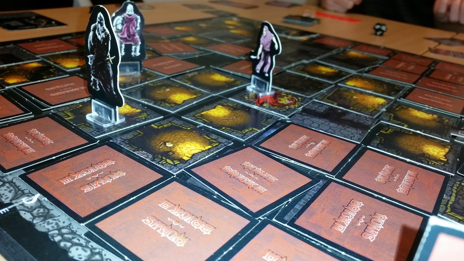
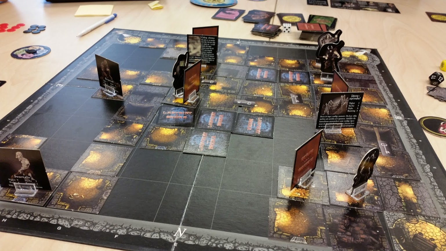
The game board consists of  9 x 9 square tiles. Each tile have two hidden cards (except the four far corner rooms); one ‘room card’ and one ‘content card’. One of the middle 3 x 3 tiles contain the ‘dragon room card’ instead of a ‘room card’. Which is the one is to remain unknown to the players.

Players take turn navigating one tile at a time through the castle. When players step on tiles containing hidden cards, the cards will be revealed, and the ‘content-‘ and ‘room card’ will come into play. The movement choices for the next round is revealed to the player via the ‘room card’, and her character is put into interaction with the ‘content card’.  If the ‘content card’ contains an item, the player can pick it up. If the card contains a monster, the player will engage in combat. If the card contains a trap or chest, the player will have to deal with it trap as the card specifies.

Characters

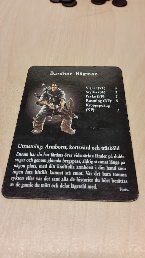
All characters have individual properties that vary drastically from each other: Some characters have special rules, some start the game with specific items in their inventory, some control an additional unit for assistance (a pet), and all have the same four attributes. All characters have a number from one to twelve in each attribute, indicating their proficiency. The higher an attribute’s number is, the higher is the chance of successfully preforming an action using that attribute. Depending on which character you play, different strategies will be available, thus the players choice of play style is dependent on which character she plays.

Actions with Attribute Roll Checks

Certain actions in the game, such as breaking locked doors, avoiding a trap, or walking across a footbridge, require the player to use one of her characters’ attributes. Any action can be attempted regardless of attribute numbers, but the number of the attribute defines weather the action succeeds or not. The attempts is made using a D12, if the player rolls less than the number of her attribute, the action is a success. some actions also take attributes of monsters into consideration.

Room Cards

Room cards define what directions are available for players to enter and exit the corresponding tile. There are also indications on the card if exits are blocked by doors or portcullises, if there’s a dungeon entrance, or if any of the walls contain hidden passages.

If a passage is blocked by a door or portcullis, the player has to use a character’s strength or agility attribute in a roll check in order to move in that direction.

Some ‘room cards’ just contain a corridor. In such a case, the corresponding ‘content card’ is ignored, and the entering player can continue through the corridor onto a new tile.

In rare cases, a ‘room card’ contains a pit or a footbridge. The pit function as a trap that if not dodged successfully, the player must enter the dungeon. The footbridge function as a one-way corridor containing a trap, if not dodged successfully, the player must discard collected treasure.

Content Cards

The ‘content cards’ provide small “scenarios” for the players. They are what urges the player to explore the castle, and invokes tension and anticipation. They contain either a reward, a challenge with risk of punishment, or in rare cases, a challenge with both risk of punishment and a chance of reward. Content cards can contain; monsters, traps, items, treasure, and in rare cases, events.

IMG_20140904_152427660

Combat

When a player enters combat with a monster, another player must pick up a monster card, containing some of the monsters properties for that fight: Health points, defining how many successful attacks it will take to kill the monster, and how it will react to each of the players available actions. The player get three choices, she can either attack, escape or wait for the monster to make the first move.  Monsters have four possible reactions; they can flee, attack, follow (only if player flees), or stand idle (not if player attacks).

The combat uses a transitive system were the player and monster pick one of the four attributes to fight with, then simultaneously reveals it to each other. each attribute is vulnerable to one other attribute and effective against another. A combatant deals one point of damage is the opponent picked the weaker attribute. If they pick the same, the combatant with the highest level in that attribute will deal the difference in damage to the opponent. this will be repeated until one combatant is defeated or if there has been no successful hits for three rounds.

Dragon Room Card

When a player enters the dragon room, they can chose to pick one  ‘treasure card’. However, if they do, they must also pick a ‘dragon card’. There are twelve ‘dragon cards’, eleven of them does nothing, but one will wake the dragon, forcing everyone in the room to battle it.

Mechanics

The core mechanics include two vital resources, the ‘health points’ and the treasure’s ‘gold worth’. There are also a number of important objects; the player’s ‘character’, the ‘dragon’, ‘room cards’, and ‘content cards’.

‘Object-‘ and ‘room cards’ are hidden from the players until a character interacts with them.  ‘Object-‘ and ‘room cards’ are paired always paired, and are both interacted with and revealed simultaneously.

The two resources are what defines the victorious and losing players; if a player depletes all her ‘health points’, she will lose the game. Though if she finishes the game with the highest ‘gold worth’ of treasure, she will win. ‘Health points’ are generally depleted when the player encounters a ‘monster’ or ‘trap’ through the interaction between the ‘character’ object and ‘content card’ objects. However, the risk to encounter something that will drain your ‘health points’ is not complete, there is also a chance that the  ‘content’ property of the card is something that benefits the player, most importantly; treasure, which will boost the player’s ‘gold worth’ resource. This risk and reward system is what drives the entire game, the player must ask herself the qustion; should I continue into the castle with the risk of dying but with a chance to earn more gold? Or should I turn back and be satisfied with what I’ve got?

Positive

I’d say that the best thing about ‘Drakborgen’ is the dragon itself. Since the rewards for looting the ‘dragon room’ are so great, it becomes a primary goal for the players to find it, encouraging them to venture deep into the castle. The fact that you know exactly what the chance of waking the dragon every time you pick a treasure is, allows for a somewhat strategic approach, which also makes it more exciting. Whereas the content of the other rooms are perceived as almost completely random. In conclusion, the tension of the risk and reward gambles are what makes the game fun.

Negative

Whats I find bad about this game is somewhat connected with what’s good about it; the fact that almost everything is decided by chance. There is almost no strategy or planning involved, since there is no way you can know anything about the outcome of your choices. There are of coarse items you can find and use in different situations, however, it’s very straight forward when you’re supposed use them, most items only really increases your chance to survive longer and  doesn’t provide you with any strategic choices.

All in all, I believe that this game could be very frustrating if you have a stroke of bad luck, since there is absolutely nothing you can do to help yourself in that situation, and it doesn’t really make you feel proud of yourself when you win, since it rarely is from your skills.

Target Audience

I would probably suggest this game for gamblers. It’s really what the whole game is about, you’re presented with a number of choices, that all has chance of rewarding you, and risk of hurting you. It is same kind of thrill which you gain from a roulette wheel or slot machine: You chose a number/decide when to press the button. The choice is really irrelevant since you can’t know what the outcome will be, but you still get the illusion that you are somehow active in deciding your fate.

I would also suggest this to pen and paper role players looking for something short and more lazy. ‘Drakborge’ reminds a lot about your traditional D&D dungeon crawler, however it doesn’t require as much time or effort, so it can be played on a lazy Sunday afternoon, when you feel like hunting some loot with your friends, but is too tired to start up a new role playing project.

Interesting system

The ‘dragon room’ is without doubt the most interesting part of the game. If a player happen to end up in the ‘dragon room’ (by interacting with a ‘room card’ that happen to have the property of being the ‘dragon room’), the dragon will come into play. Each round every player positioned in the ‘dragon room’ has the chance to interact with the dragon once. If a player choose to interact with the dragon, she will gain a random treasure card, increasing her ‘gold worth’. However, each time a player interacts with the dragon, there is a risk of changing the state of the the sleeping dragon to awake, changing it’s behavior to that of an active monster. The risk of waking the dragon starts at 1 to 12 and increases with each interaction until the risk  is 1 to 1, and waking the dragon is inevitable.

This system creates an interesting dynamic that challenges the players greed. The player is seduced to stay by being continuously rewarded, but increases the danger the longer she stays.

Conclusion

The player is tempted by treasure (to win the game) and curiosity  to discover the map and find out what awaits them in the tunnels. By digging deeper into the castle, the players can can find more treasure and miscellaneous items, but it also means exposing themselves to danger.

In conclusion, the game plays with similar base rules to ‘Greedy Pig’ mixed with elements of exploration. The risk and reward system is what this game is all about, and the trick is to know when to stop. It’s quite a bit of fun as long as you don’t take it to seriously and get upset when things go bad.

IMG_20140904_151947699